
TLDR: I designed a banner to hang in my church’s sanctuary that represents the UUA Shared Values. I’ll share all the details of my design process here, just in case that’s helpful for anyone else who is working on their own design. In a separate post, I’ll share printable patterns you could use to create your own banner with craft felt and glue (or fusible interfacing), felted wool appliqué, quilting or other media.
What are the UUA Values?
In June 2024, the Unitarian Universalist Association adopted Article 2, which included these six shared values, with love at the center.
- Justice: We work to be diverse multicultural Beloved Communities where all feel welcome and can thrive.
- Equity: We declare that every person is inherently worthy and has the right to flourish with dignity, love, and compassion.
- Transformation: We adapt to the changing world.
- Pluralism: We are all sacred beings, diverse in culture, experience, and theology.
- Interdependence: We honor the interdependent web of all existence and acknowledge our place in it.
- Generosity: We cultivate a spirit of gratitude and hope.
Tanya Webster created multiple graphics to represent these values and the UUA says “We also encourage others to consider creating their own visual presentations.” So I set about designing one that would work well for applique.
Inspirations for My Design
Here are my key inspirations:


Words or Icons: The UUA logos by Webster shown above are very dependent on the words for each value – long words like interdependence just don’t work well for appliqué, so I knew using icons would be a better approach – I brainstormed ideas for icons, and then I discovered Catherine Loya’s icons and she’d come up with almost the exact same set of ideas I had! It’s always a good sign for the recognizability of icons when they seem apparent to a variety of people.
Flower Shape: I played with the idea of using the UUA flower image but replacing the words with icons on them, but the icons would have been fairly small in the overall image, and would be hard to view from across the room. I preferred the flowers by Loya and especially the flower by Madaline Natale, which gave a bigger space for the icons. I preferred Natale’s pointed petals, as I worried the heart-shape on Loya’s just added too much visual information.
For Colors: I assumed that they all were rainbow color and I expected that there would be a standard layout of colors, and that each of the values would be associated with a particular color. But when I looked closer, I discovered that the UUA graphics don’t even have all the rainbow colors. Loya has them, and in rainbow order, but read counter-clockwise. Natale has the rainbow colors, read clockwise with red at the top, and that felt right to me.
There is zero consensus in how the colors lined up with the values.
| Value | UUA flower | UUA atom | Loya | Natale |
| generosity | green | pink | green | blue |
| transformation | pink | blue | purple | yellow |
| equity | purple | green | red | orange |
| pluralism | blue | red | blue | green |
| interdependence | red | purple | orange | red |
| justice | yellow | yellow | yellow | purple |
I tried really hard to come up with some logical way of connecting things to a color… like I felt like green could be generosity (money is green and that’s one form of being generous) or green could be the interdependence of nature, but I couldn’t make any other good arguments for what color should be which.
Order of Ideas: There was also no consensus for what order to list them in. The UUA language has them in this order. IPGTJE (interdependence, pluralism, generosity, transformation, justice, equity). But there’s a goofy mnemonic that can be used for remembering all the values, which is JETPIG. (Here’s one fun song about JETPIG, and here’s a song with hand gestures.) So, that’s the order I chose.
In the end, I put the colors in rainbow order, with the red at 12:00, and the other colors in clockwise ROYGBP order. I started the JETPIG order at 12:00, so Justice is red, equity is orange, and so on.
My Final Design
A six petaled flower, with a pink heart in the center representing love.
The red petal has the scales of justice, which is a common, and thus easily recognizable and memorable, image for Justice.
The symbol for equity on the orange petal was inspired by a meme based on a cartoon by Craig Froehle which I believe many people are familiar with. Here is one version of it, from Interaction Institute for Social Change, Artist: Angus Maguire.
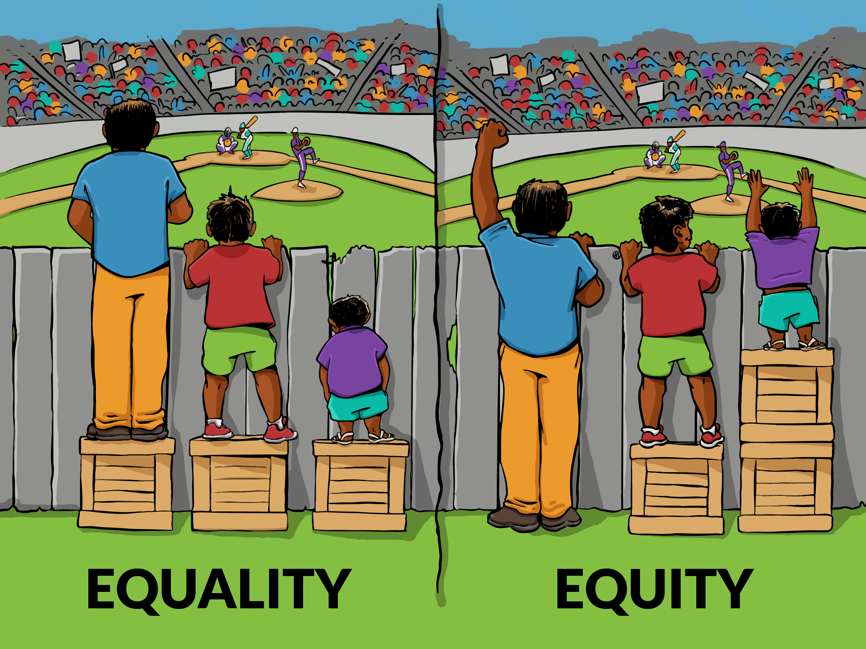
Loya’s icon turned this into three little snowmen standing on boxes. I decided to use a “meeple” shape that looked a little less abstract / more human, but would still be easy to appliqué. (Note: I am well aware that this icon does not represent all people – I have one leg myself, so it’s not what my own personal meeple would look like, but it is a simple representation of a human shape.)
For Transformation (on yellow), I’d originally considered a butterfly, but I think Loya’s use of the chrysalis is much better than a butterfly. The butterfly implies that the process of transformation is complete, versus the UU value of continuous adaptation to a changing world is like a chrysalis in the midst of changing.
For Plurality (on green), the interlocking circles address intersectionality and diversity in community. We are all unique individuals, but can come together to find our commonalities and the ways in which we overlap to work together as a diverse whole.
For Interdependence, on blue, what could be better than a spider web, which reflects the previous UU language of “the interdependent web of all existence.”
For Generosity, on purple: I liked that Loya’s icon captures a chalice feel with the two hands holding up a flame with a heart in it. However, my partner suggested that the two hand image looked more like support or “lifting something up”, and that a single hand handing the flame to someone as a gift would better represent generosity.
Appliqué Project
I made two versions. Left: has acrylic felt backing and icons, the colored felts are wool, and it is held together with fusible interfacing. Right: all felted wool, with the pieces sewn on with embroidery floss and blanket stitching.

Check my other post for the pattern, instructions and supply list for the project.
Handouts
I made two handouts / posters to accompany these. The first one just uses the text from the UUA describing the Values, with my icons next to each. The second is sort of an “artist’s statement” that describes why each image was chosen to represent the value – it is my hope that describing the ideas behind the design will help make it easier for people to visualize and remember the Shared Values.
And just for fun, I also made a “JETPIG” to match each banner.


